Here is the final Flash Banner.

Showing posts with label design exercise. Show all posts
Showing posts with label design exercise. Show all posts
Thursday, 18 February 2010

Sunday, 14 February 2010
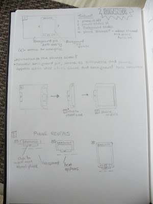
Banner - Sketches
Here are some sketches Ive done. As i have never done a banner before i want to keep the idea simple (boring) so i an get to grips with Flash and later on develop the banner further.


Friday, 12 February 2010
Design Exercise 13 - Samsung Jet
For the design exercise I have chosen to use my phone (Samsung Jet).
 Current Advertisement
The current TV/Web advertisement being broadcast is based around being impatient. This obviously reflects the phones selling point about being the fastest phone with its 800 MHZ processor.
Below is a screenshot of Samsungs banner/advertisement from there website. From what I can make out, they used Flash with XML.
Current Advertisement The current TV/Web advertisement being broadcast is based around being impatient. This obviously reflects the phones selling point about being the fastest phone with its 800 MHZ processor.
Below is a screenshot of Samsungs banner/advertisement from there website. From what I can make out, they used Flash with XML.

Design Exercise 13 - Banner
Scenario: You work for a web design company that has been commissioned to develop a new campaign for your mobile phone.
The part of the site you will create is a simple FLASH animation that links to a main product website and is to be deployed across a variety of websites.
It should consist of at least 6-8 separate sections that include some animation and interaction. Research your phone and its current advertisement and build a new campaign banner.
The part of the site you will create is a simple FLASH animation that links to a main product website and is to be deployed across a variety of websites.
It should consist of at least 6-8 separate sections that include some animation and interaction. Research your phone and its current advertisement and build a new campaign banner.
Who will the audience be?
What is the message that needs to be communicated?
How will the FLASH banner appeal to the intended audience?
What are the designs for the visual appearance (provide 6 minimum)?
How will the interaction work (provide 4 variations minimum)?
Does the interaction increase the ability to communicate the intended message?
If so then how?
Provide an evaluation (300 words) of the final implemented design.
Did the design and implementation succeed (Yes/No)?
Where did it succeed?
Where it failed how would you improve the design and/or implementation.
Friday, 5 February 2010
Design Exercise 12
 Homepage
My first impression of Metalab's Tumblr theme is both positive and negative. I think web 2.0 idea of clean, simple and gleaming with colour is the way forward keeping in with the new trend. I do not like the sudden impact of a rainbow colour theme in the background. It clashes and compromises content in the way your eyes are not drawn to the more important content e.g. the users photos.
I do not like the way they have used the new trend of transparency and overlapping graphics. It is a good concept but does not work with the background image. The structure of the website however compliments the fundamentals of Web 2.0 in using the idea of simplicity.
One of the elements which i like and would consider using is the 'Tumblr theme'. The Tumblr theme from what i can make out is a sharing application, which allows users to effortlessly share anything e.g. photos and videos. You download a theme which allows customizable pages using html and CSS.
I have researched into the website but have not managed to locate a portfolio website to get an idea of the style they have used. From what i can make out is that it was designed by Jacob DeHart along with his wife Mischa. Jacob has a website but currently has nothing on his website apart from his contact details.

Jacob DeHarts Website

Spaceship Collaborative - Company's Website
Thursday, 28 January 2010
Validated
Ive finally got round to validating my website which to my suprise, did not come back with any errors! lol

Subscribe to:
Posts (Atom)