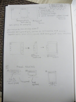
Some sketches and notes I made for the initial Wireframes...
Monday, 1 March 2010
Brief 2 Client
For my project I am designing a website for my friend Kelly Webster. She is a Director who specialises in Horror/Thriller type videos. She wants a website creating which reflects herself but is mainly used as a portfolio website.
Client information:
Name: Kelly Webster
Type of Website: Personal/Portfolio
Favorite Colour: Green
Layout: Simple and clean
Social Networks: Twitter, Facebook, Youtube.
To get and idea of what Kelly regards to as a 'simple' website. I asked her if she could provide me with an example website.
The following website is a website she likes (Adline) which is a co-workers of hers. She is not bothered about a fancy website, she just wants a website which gets across the message in a basic form.
Antony lane -Filmmaker

Friday, 26 February 2010
Artist Website - Brief
Exploring Multimedia :
Interactive Media Pathway
WEB Design, WEB Applications & Interaction Design:
Assignment Brief Two
Interactive Media Pathway
WEB Design, WEB Applications & Interaction Design:
Assignment Brief Two
Set Week 29 (12.02.2010)
Deadline Week 34 (19.03.2010)
Brief: Artist/Arts Organisation Website
Design and build a artist / arts organisation website. A site which acts as a promotional website for an individual/organisation and which will increase both profile and online traffic for the client.
The choice of artist is wide and could include musician, craftsperson, writer etc etc.
These must be real individuals either known to the designer or if not known then with sufficient background material available (on or offline) to make an effective ‘mock’ website (not historical or dead artists!). They can be real ‘live’ commissions if available.
Include:
- 5 page website (minimum)
- Widgets
- Flash Banner
- Diary/Journal page XHTML/CSS
- Database using MySQL (to store user info etc)
- ERD to document your database design
- Journal page must have an option to upload an image/video
- Contact info and form
- Link to social networks e.g. Facebook, Twitter, Myspace
- Validated to W3C standards
Thursday, 18 February 2010
Tuesday, 16 February 2010
Sunday, 14 February 2010
Banner - Sketches
Friday, 12 February 2010
Design Exercise 13 - Samsung Jet
For the design exercise I have chosen to use my phone (Samsung Jet).
 Current Advertisement
The current TV/Web advertisement being broadcast is based around being impatient. This obviously reflects the phones selling point about being the fastest phone with its 800 MHZ processor.
Below is a screenshot of Samsungs banner/advertisement from there website. From what I can make out, they used Flash with XML.
 Current Advertisement
 The current TV/Web advertisement being broadcast is based around being impatient. This obviously reflects the phones selling point about being the fastest phone with its 800 MHZ processor.
Below is a screenshot of Samsungs banner/advertisement from there website. From what I can make out, they used Flash with XML.

Design Exercise 13 - Banner
Scenario: You work for a web design company that has been commissioned to develop a new campaign for your mobile phone.
The part of the site you will create is a simple FLASH animation that links to a main product website and is to be deployed across a variety of websites.
It should consist of at least 6-8 separate sections that include some animation and interaction. Research your phone and its current advertisement and build a new campaign banner.
Who will the audience be?
What is the message that needs to be communicated?
How will the FLASH banner appeal to the intended audience?
What are the designs for the visual appearance (provide 6 minimum)?
How will the interaction work (provide 4 variations minimum)?
Does the interaction increase the ability to communicate the intended message?
If so then how?
Provide an evaluation (300 words) of the final implemented design.
Did the design and implementation succeed (Yes/No)?
Where did it succeed?
Where it failed how would you improve the design and/or implementation.
Friday, 5 February 2010
Design Exercise 12
 Homepage
My first impression of Metalab's Tumblr theme is both positive and negative. I think web 2.0 idea of clean, simple and gleaming with colour is the way forward keeping in with the new trend. I do not like the sudden impact of a rainbow colour theme in the background. It clashes and compromises content in the way your eyes are not drawn to the more important content e.g. the users photos.
I do not like the way they have used the new trend of transparency and overlapping graphics. It is a good concept but does not work with the background image. The structure of the website however compliments the fundamentals of Web 2.0 in using the idea of simplicity.
One of the elements which i like and would consider using is the 'Tumblr theme'. The Tumblr theme from what i can make out is a sharing application, which allows users to effortlessly share anything e.g. photos and videos. You download a theme which allows customizable pages using html and CSS.
I have researched into the website but have not managed to locate a portfolio website to get an idea of the style they have used. From what i can make out is that it was designed by Jacob DeHart along with his wife Mischa. Jacob has a website but currently has nothing on his website apart from his contact details.
Jacob DeHarts Website

Spaceship Collaborative - Company's Website
Tuesday, 2 February 2010
My 2 Retail Websites
My original Version of my website before i changed it.
 This is my website after a re-design.
 This is my website after a re-design.
Monday, 1 February 2010
Saturday, 30 January 2010
Website re-design
Thursday, 28 January 2010
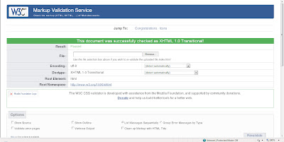
Validated
Wednesday, 27 January 2010
Broad Oak Website Elements
I have decided for one of my website elements i wanted to bring a vector version of their oak tree. I did this by taking the photo of the tree and drawing it using the 'Pen' tool in Illustrator CS3.

Tuesday, 26 January 2010
Criticism
Now that i have put my first initial website together i received feedback from my tutor to make changes and now come up with more ideas for our website.
Points made about my design:

Points made about my design:
- Too much white space
- Not symmetrical enough (the tree is off centred making the design look off centre)
- Size is too small (I made the design 800 x 600 but realised it doesn't work with bigger monitor sizes

Wednesday, 20 January 2010
Tuesday, 19 January 2010
Pictures for website
Saturday, 16 January 2010
Sunday, 10 January 2010
Wordpress Blog
Waterfall VS Whirlpool Software Models
In the early stages of software development it was recognised as the main model for many systems. The solution offered steps early providing requirements early. Each of the various stages is approached, completed and signed off before moving onto the next step.
This model also was made with the intension of being able to ‘Freeze’. This allowed anyone to stop the process and move onto the next one. This in my opinion can cause allsorts of problems varying from design changes to time management errors e.g. imagine freezing a construction of a building and going back to it later with a different approach.

In comparison the Whirlpool I think is a better approach if I were to use if for a website. This process would allow me to go back on designs and implement them as building blocks providing a more in-depth approach. This would provide me with the option of working on one stage at a time.
Whereas if I used the ‘Waterfall’ process, I would be able to get a good idea of my website process before any actions but doesn’t allow any options for major changes. Only the option to ‘Freeze’ my design, but the downside is I can’t change anything in the design.
The Whirlpool software development process can be used in Web Design.
This model also was made with the intension of being able to ‘Freeze’. This allowed anyone to stop the process and move onto the next one. This in my opinion can cause allsorts of problems varying from design changes to time management errors e.g. imagine freezing a construction of a building and going back to it later with a different approach.

The ‘Whirlpool’ model has a much better system than the ‘Waterfall’ model as it allows changes over and over again. This holds no restrictions when it comes to the process which allows a more in-depth approach allowing such problems as expense and errors being notified before action.


In comparison the Whirlpool I think is a better approach if I were to use if for a website. This process would allow me to go back on designs and implement them as building blocks providing a more in-depth approach. This would provide me with the option of working on one stage at a time.
Whereas if I used the ‘Waterfall’ process, I would be able to get a good idea of my website process before any actions but doesn’t allow any options for major changes. Only the option to ‘Freeze’ my design, but the downside is I can’t change anything in the design.
The Whirlpool software development process can be used in Web Design.
Brief
Research
Development
Design
Implementation
Testing
Deploy
Maintenance
Saturday, 2 January 2010
3 Influential Practitioners
We had to talk about three practitioners that influence us which are not Web Designers.

Alan Becker is a Flash Animator was born in Ohio, he first started out just simply drawing at home and coming up with ideas for animation. He started at an early age and studied Flash and other software before he was discovered over the internet through a website called Deviantart.
The below animation; which was the animation which first caught my eye is the animation which allowed me to discover his works. I like the unusual idea of his work and the idea of how simplistic it is. One of the most inspiring things that I like is the thought of being discovered online; which is one of many new opportunities. I hope to use this idea by creating a portfolio website and publishing it to the web.
http://fc01.deviantart.net/fs13/f/2007/077/2/e/Animator_vs__Animation_by_alanbecker.swf.
To choose 3 top designers that influence me is hard; I have so many designers which influence me in many different ways. Below are 3 of them and what aspects of their work inspire me.
Vitaly Alexius is a Freelance Illustrator/Photographer. He was born in 1984 in an industrial city of Novokuznetsk in Siberian Russia. He had been interested in drawing since he was about 4. He did several courses in Traditional Drawing and Illustration. He wasn’t known until he found a programme called Photoshop which allowed him to express his talent.
Most of Vitaly’s work uses traditional art mixed in with illustration. I like his use of colours to represent/express different moods. I also like the way he uses past and futuristic elements to create a virtual world. But what inspires me most is that he is able to express himself freely. He has no limitations. I want to take this idea of no limitations and being able to push the boundaries of creativity of Web design.

Vitaly Alexius Illustrator
Vitaly Alexius is a Freelance Illustrator/Photographer. He was born in 1984 in an industrial city of Novokuznetsk in Siberian Russia. He had been interested in drawing since he was about 4. He did several courses in Traditional Drawing and Illustration. He wasn’t known until he found a programme called Photoshop which allowed him to express his talent.
Most of Vitaly’s work uses traditional art mixed in with illustration. I like his use of colours to represent/express different moods. I also like the way he uses past and futuristic elements to create a virtual world. But what inspires me most is that he is able to express himself freely. He has no limitations. I want to take this idea of no limitations and being able to push the boundaries of creativity of Web design.


Alan Becker Flash/Animator
Alan Becker is a Flash Animator was born in Ohio, he first started out just simply drawing at home and coming up with ideas for animation. He started at an early age and studied Flash and other software before he was discovered over the internet through a website called Deviantart.
The below animation; which was the animation which first caught my eye is the animation which allowed me to discover his works. I like the unusual idea of his work and the idea of how simplistic it is. One of the most inspiring things that I like is the thought of being discovered online; which is one of many new opportunities. I hope to use this idea by creating a portfolio website and publishing it to the web.
http://fc01.deviantart.net/fs13/f/2007/077/2/e/Animator_vs__Animation_by_alanbecker.swf.
Nina Matsumoto Cartoonist
Nina Matsumoto is a Japanese-Canadian comic book artist and writer, also known as space coyote, and most known for creating the comic book series Yōkaiden for Del Rey Manga. She created the webcomic Saturnalia and has also done work as a penciller for Bongo Comics.
What I like most about Nina’s work is she uses her own imagination rather than sticking to a list of rules.. One of my favourite pieces of work is her manga stylized parody (below). She has took the cast of the Simpsons and created a unusual concept. What attracts me most about her work is she is able to take current/existing ideas and put her mark on it through re-creation. I want to build on my web skills by re-designing current websites and making them my own style.
What I like most about Nina’s work is she uses her own imagination rather than sticking to a list of rules.. One of my favourite pieces of work is her manga stylized parody (below). She has took the cast of the Simpsons and created a unusual concept. What attracts me most about her work is she is able to take current/existing ideas and put her mark on it through re-creation. I want to build on my web skills by re-designing current websites and making them my own style.
Thursday, 10 December 2009
Wednesday, 9 December 2009
Validation Errors
I have finally come round to validating my website!. I have encounted 28 errors! im going to attempt to fix them now.


Tuesday, 8 December 2009
Browser Testing
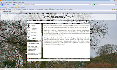
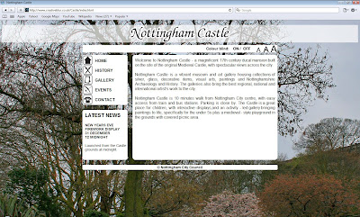
Before validating my website I'm going to test my website in different browsers using (www.brosershots.org) and on my own computer. The screenshot below proves my website works in the following browsers.
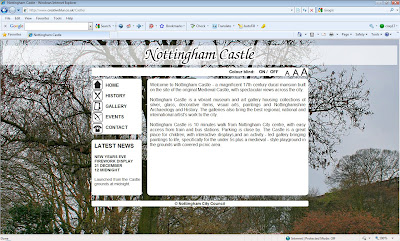
Internet Explorer 8 (working)

Firefox v 3.5.5 (working)

Safari v 4.0.4 (working)

Thursday, 3 December 2009
Colour blind - Vis Check
Vischeck is a program that shows what a webpage looks like in a browser to a person that is colour blind. You can select from different types of colour blindness and preview in a few seconds!
I plan on testing my website in this.
http://www.vischeck.com/
I plan on testing my website in this.
http://www.vischeck.com/
Tuesday, 1 December 2009
Research - Colour Blind - useful Tools
Today i found a useful tool which is a plugin for Photoshop that stimulates red/green colour blindness . I plan on using it in my website.
Example:
Example:
Subscribe to:
Posts (Atom)


