Example:

Tuesday, 1 December 2009
Research - Colour Blind - useful Tools
Today i found a useful tool which is a plugin for Photoshop that stimulates red/green colour blindness . I plan on using it in my website.
Example:
Example:


Monday, 30 November 2009
Website Research
Website - www.magicsocket.com
Type of site – Portfolio website
About – The online portfolio of magicsocket, an interactive agency from Turin (Italy) specialised in the creation of Digital Products based on Adobe Flash technology.
I think this website is very well laid out keeping the navigation simple and easy to follow. The use of contrasting colours makes the website more eye-catching and easy to read.
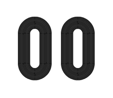
For the opening of the website they have a loading screen using scalextrics tracks which they put together to make up the numbers.
Type of site – Portfolio website
About – The online portfolio of magicsocket, an interactive agency from Turin (Italy) specialised in the creation of Digital Products based on Adobe Flash technology.
I think this website is very well laid out keeping the navigation simple and easy to follow. The use of contrasting colours makes the website more eye-catching and easy to read.
For the opening of the website they have a loading screen using scalextrics tracks which they put together to make up the numbers.

On the homepage of the website they have used and Scalextric tracks as their main theme incorporated into the site. Magicsoket have used Flash to create a Scalextric game which the user gets to select a car and race around the track. Once the viewer races around the track the page starts to navigate around with you.
Friday, 20 November 2009
Javascript - Breaking down the code!


Wednesday, 18 November 2009


Saturday, 14 November 2009
Traingle Rule
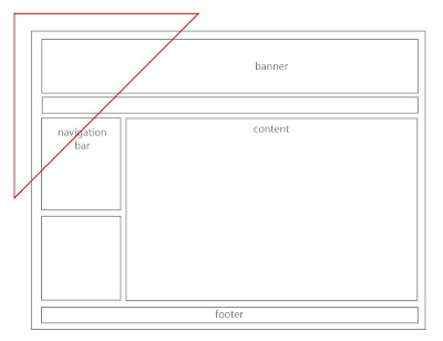
The picture below shows one the main hotspots where the majority of viewers eyes are drawn onto the screen first. Ive based my design around this as a way of experimenting with design structures.
Friday, 13 November 2009

Colour Wheel
Today we looked at Colour wheels and how certain colour an compliment and contrast with each other.
Below the colour wheel is an exmple of my favorite analogous colour combination. Both colours work well together because they are easy on the eye.


Below the colour wheel is an exmple of my favorite analogous colour combination. Both colours work well together because they are easy on the eye.


Tuesday, 10 November 2009


Sunday, 1 November 2009

Wednesday, 21 October 2009
Journal Task – 3 user based websites
For our journal task we were asked to find 3 websites providing user generated content
http://www.photobucket.com/
Photobucket is an image hosting website allowing users upload photo content varying from personal to professional photography photos. Over time the website has broadened their content allowing users to upload videos too. The website structure is very simplistic with the simple navigation bar at the top and sub categories to the left, thus allows more space for user generated content to be listed. The use of colour has been kept minimalistic using blue and cream as the centralised colours plain against the varied content uploaded.
http://www.cafepress.co.uk/
Cafepress is a template and user driven website offering users to purchased custom made t-shirts. Users can either upload photos to templates or upload their own designs to share. This also offers fan bases e.g. Twlight to generate content and share their passion for the film. The website uses the top-down navigation keeping it simple; also using bright clean colours making it look busy.
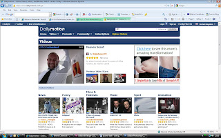
http://www.dailymotion.com/
Dailymotion is about finding new ways to see, share and engage your world through the power of online video. You can find/upload videos about your interests and hobbies, eyewitness accounts of recent news and distant places. The website is very self explanatory with the simple navigation bar and big headings showing where you are. The use of a star rating allows the users to view categories in a different way, allowing them to view comments from other users.
http://www.photobucket.com/
Photobucket is an image hosting website allowing users upload photo content varying from personal to professional photography photos. Over time the website has broadened their content allowing users to upload videos too. The website structure is very simplistic with the simple navigation bar at the top and sub categories to the left, thus allows more space for user generated content to be listed. The use of colour has been kept minimalistic using blue and cream as the centralised colours plain against the varied content uploaded.

http://www.cafepress.co.uk/
Cafepress is a template and user driven website offering users to purchased custom made t-shirts. Users can either upload photos to templates or upload their own designs to share. This also offers fan bases e.g. Twlight to generate content and share their passion for the film. The website uses the top-down navigation keeping it simple; also using bright clean colours making it look busy.

http://www.dailymotion.com/
Dailymotion is about finding new ways to see, share and engage your world through the power of online video. You can find/upload videos about your interests and hobbies, eyewitness accounts of recent news and distant places. The website is very self explanatory with the simple navigation bar and big headings showing where you are. The use of a star rating allows the users to view categories in a different way, allowing them to view comments from other users.

Sunday, 17 May 2009
Friday, 10 April 2009
Avatar Element - Head
I'm finding it quite difficult to create an avatar because I still don't understand where half the buttons are!
Friday, 3 April 2009
Showcase Ideas
I've been trying out various tutorials over the past few weeks which i why i haven't posted much.
I have started to create my room for my showcase and thought i will post it up.
I have created a base model of what my room looks like and now I'm going to start to create objects and lighting.

Wednesday, 1 April 2009
Logo

Saturday, 28 March 2009

Wednesday, 25 March 2009
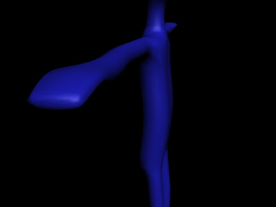
Avatar - Body
A render of my Avatars body which i currently at the first stage. I have yet to edit the hands and arms but I just wanted to create a base model to work with.
Sunday, 22 March 2009

Thursday, 19 March 2009
Box/Showcase Element Ideas
Just thought i would post my ideas on my element ideas and what stage I'm at.
AV Element - Thinking of remixing a song or doing a pixilation of myself.
Logo - Done a few designs but still needs allot of work.
Avatar - Currently creating my Avatars head, still need to do the body
Website - I'm still designing the website but Ive purchased a webspace and Ive got to wait a few days until i can upload anything.
Other Element - Still thinking about what to do for this.
Sunday, 8 March 2009


Thursday, 26 February 2009
Biped Man
Today with Andy Love we had to rig a Biped man using 3D Studio Max. Im going to edit it later but for now im going to post my first attempt.
Monday, 23 February 2009
Tutorial - Computer Monitor
To get used to 3D Studio Max I decided to find a random easy tutorial to see if I could do a low poly model.
Tutorial - Computer Monitor
Website: http://www.cglearn.com/tutorials/max5/harnessing_03.21_lowpoly.html
A Screenshot of the finished PC Monitor
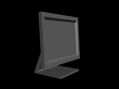
Tutorial - Computer Monitor
Website: http://www.cglearn.com/tutorials/max5/harnessing_03.21_lowpoly.html
A Screenshot of the finished PC Monitor
Friday, 20 February 2009
Car Modding - UVW Editor
Today we were given a model of a car which we had to customise in own own way. We were given the body but with Andys guide we were shown how to use Photoshop to make better textures for our models.


Saturday, 14 February 2009
Basic Human Model
Today we had to create a basic model of a human using Low Poly blocks. Once we had been shown how to go about it I could believe how simple it was to do.


Wednesday, 4 February 2009
My Mood Board
I Quickly came up with a mood board which isnt the mood board for my Box/Showcase but is just for pure inspiration. I am goin to do do a uptodate version containing fewer images and trying to get some sort of a theme going.

On this mood board I have alot of varied content including games, comedy, football, cars, food and girls.
I havent yet got an idea for my Box.Showcase but am going to come up with another mood board and brainstorm some ideas.

Friday, 23 January 2009
Identities - Autodesk 3d Studio Max - Text
For our first Identities seminar we made 3d text using Autodesk 3d Studio.
Sunday, 18 January 2009
Diary
Day 10
After I got bored of looking around I decided o interact/Socialise with other people and I found that after talking to most people on the game were just socialising with friends who they know. A few people were looking to make new friends and I only found 1 person who was on there for business.
If I were to just socialise with friends online I would use Facebook. I mean if you think about it Facebook can be accessed from anywhere with an Internet connection, Second life you would have to install it on every machine.

Thursday, 15 January 2009
Diary
Day 7

Over the past few days all I have done is browsed and looked to see what free stuff I can get. Below is a screen shot of the first interactive object which I was able to obtain free stuff from clothes to accessories.

Tuesday, 13 January 2009
Diary
Day 5
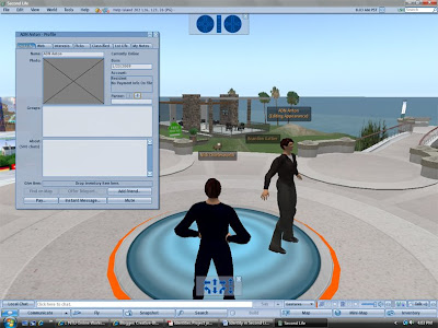
After a couple of times looking around the virtual world I was amazed to come across so many object to interact with. I couldn’t believe how sad it was when I came across a chair and a message popped up saying ‘do you want to sit down’. I mean how pointless and weird that is!!!
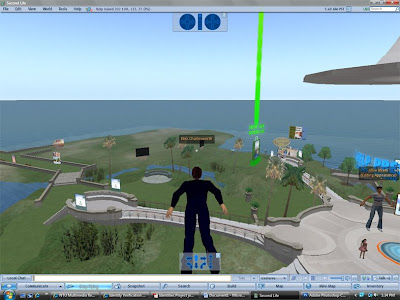
During my time on Second life I experienced the so called new feature where the user is able to fly around so they can get where they need to go quicker. Below is a screen shot of me exploring the sites.
After a couple of times looking around the virtual world I was amazed to come across so many object to interact with. I couldn’t believe how sad it was when I came across a chair and a message popped up saying ‘do you want to sit down’. I mean how pointless and weird that is!!!
During my time on Second life I experienced the so called new feature where the user is able to fly around so they can get where they need to go quicker. Below is a screen shot of me exploring the sites.

Thursday, 8 January 2009
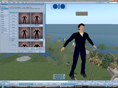
My Second life Avatar
Day 1
The first day on second life I didn’t really do much because I spent most of the time looking at the interface and Navigation.
First thing I did was customising my own Avatar and played around to see what was available. At first I thought that there would be loads of options of clothes and designs but after was disappointed to find only a small selection of clothes.

Thursday, 1 January 2009
Scond Life - First thoughts
I would like to begin with by saying that I DONT LIKE SECOND LIFE!!! I think Second Life is just a way for antisocial people to communicate and make a 3d Avatar of themselves to hide away from the real world. But aside from being lame it has a benefit for in-world-businesses residents as they can promote and show off their company virtually.
Thursday, 18 December 2008
Interactive Narrative - Finished Game
Ater long hours our of boring myself with the great Flash tutorials i have FINISHED my game.
http://fc14.deviantart.com/fs38/f/2008/351/2/e/Pimp_My_Ride_V1_by_creativeblur20.swf
http://fc14.deviantart.com/fs38/f/2008/351/2/e/Pimp_My_Ride_V1_by_creativeblur20.swf
Interactive Narrative - Structure
After continplating about several ideas i have chosen to stick with my first idea which is the game based on the Tv show 'Pimp my Ride'.
Below is the structed plan showing one of the cars for my Interactive Narrative game.

Below is the structed plan showing one of the cars for my Interactive Narrative game.

Interactive Narrative - Ideas
For my Inerative Narrative project I have several ideas in my head and currently working on one of them which im goin to talk about below.
Idea:
The whole idea is to have a game based on the TV Show 'Pimp my Ride' (www.pimpmyride.com). The whole point of the game is to select a run down car and modiie it.
The game consists of the following:
Intro: A small animated screen with flashing images
Menu: On the menu is where i am goin to have options to choose from different cars
Modification page: Once the car has been chosen, the viewer can then add mods to their car
Wednesday, 3 December 2008
Monday, 24 November 2008
Rule of Thirds - Definition
The rule of thirds is and imaginable grid made up of 4 lines 2 horizontal and 2 vertical evenly spaced making up 9 sections. The 4 points where the lines meet makes up points where compositional elements should be placed, making it aesthetically pleasing to the eye.


Below is an example of how a picture should look with the rule of thirds. As you can see the Leaf is positioned to the right of the picture and is running along the right line and the base of the leaf is on the 3rd intersection.


Complementary Colours
Task:
Take two photographs based on a theme of your choice. Using Photoshop change and replace the colours to express complementary pairs of colours. Explain your choice of colours.
History:
Complementary colours are colours found on opposite side of the colour wheel. The Primary colours complementary colour is a combination of the other two Primary’s mixed together, for example:
Red complements Green - which is created through mixing blue and yellow
Blue complements Orange - which is created through mixing red and yellow
Yellow complements Purple - which is created through mixing blue and red
The University of Nottingham - Jubilee Campus
For this picture I have decided to change the Blue (Sky) and the Orange (Building) colours and switched the colours around to give the picture an airy feel.
For this picture I have decided to change the Blue (Sky) and the Orange (Building) colours and switched the colours around to give the picture an airy feel.


The Town Arms Public House
For this picture I wanted to achieve an unrealistic (almost cartoon looking) using filters and colour replacements to make the building look like Lego.


Thursday, 20 November 2008
FIGURING LIGHT - Write 200 words
For this Journal task we had to go and visit the FIGURING LIGHT, Colour and The Intangible Exhibition at Djanogly Art Gallery, Lakeside. Choose a piece of work and write 200 words about the artist use of colour and light.
 In this drawing Duncan Bullen’s use of colour is minimalist in the way he only uses 3 colours (Red, White and Blue). These colours are effective in the way they contrast each other on opposite sides of the colour wheel. I like they way he portrays the use of solid colours and trying to avoid shades.
I think he uses red as the central colour giving the dots a real sense of energy and power over the blue. Using the red to construct a veil of marks, which in turn creates space where colour generates a field of light – a visual energy.
Duncan is known for using dots to portray a shape or pattern instead of rectangle blocks. I think it’s good where he uses blue and white to make the picture sharp and clean.
Duncan uses aluminium to help give this picture a reflective look which gives it more brightness and luminosity. Another way in which the artist uses bright colours to resemble light is his choice of colours and how choosing 2 of the brightest colours immediately gives the feel of light. Apart from using bright colours to represent light, Duncan uses a hint of red acting as a contrasting colour to give the picture a 3D look.
Duncan Bullen Drawing #1. 04.08, 2008
www.duncanbullen.com
Picture from - http://www.axisweb.org/works/full/b683/74164.jpg
Wednesday, 5 November 2008
Journal Task - Understanding Design Methodologies
Why is it that we want our belongings to do more for us than to function well?
In today's society image is everything, from what mobile you have to what you wear. When purchasing a product I always think about how this will look on me, How big it is and missing the point of its functionality. Just take onslaught of advertisements today and you can see the latest craze and larger companies using celebrities and actors to advertise their product. They are perceiving us into thinking we have to buy this to be cool.
Also with this obsession with image today most companies are opposing over image rather than function, so in my opinion is we are not advancing more in function rather we are advancing in the look of a product.
Why are we willing, as soon as we can afford it, to pay extra for things with appealing forms?
I believe it is because we are obsessed with having the latest technology and look to impress our mates. When we have this picture of how others will see us then its gone past choosing whether you want the product. Its giving us temptation.
For me I want to talk about my Samsung G600.
 At the time i purchased this product I was drawn into buying this by advertising. I seen it on TV, Billboard's and some my mates had them. It was affordable and was awaiting on my purchase.
Its funny how technology overpowers our thought process to perceive us into thinking about having the latest model phone. When i brought this I didn't think much about how it looked I just was more concerned I had the latest version of the mobile.
Tuesday, 4 November 2008
Subscribe to:
Posts (Atom)